
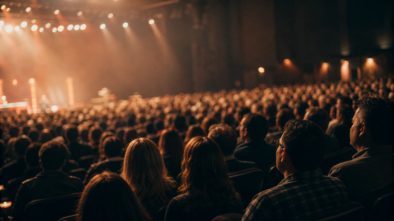
Your engagement numbers look incredible.
Session attendance up 18%. Live polls 4x last year. Q&A submissions through the roof. Mobile app DAU 91% of registered attendees. The post-event report is going to crush it on the engagement slide.
Then a sponsor calls you on Monday and asks how many real conversations they had with prospects.
You don't know. Because nobody's tracking that.
This is the engagement trap. Modern events are full of activity, and increasingly empty of connection. Attendees are engaged, but they're not connecting with each other. Those are very different things.
Here's the gap between what your dashboard shows and what actually happened in the room. And how the smartest organizers in 2026 are closing it.
Engagement vs Connection: They Are Not the Same Thing
§ 01 · DiagnosisEngagement measures attention. Did people show up, click, vote, post, react? Connection measures relationships. Did people meet someone they'll work with, hire, partner with, or call again?
High engagement can actively hide low connection. Your dashboards light up while the room stays in its own bubbles. Here are the five attendee types making your numbers look great, and your sponsor reports look worse:
- The Pollsters (24%)Voted on every prompt. Spoke to nobody.
- The App Scrollers (32%)Refreshed the agenda 18 times. Saved 0 contacts.
- The Front-Row Loyalists (18%)Attended 11 sessions. Met one person, at coffee, by accident.
- The Gamification Hunters (14%)Scanned 30 booths. Couldn't name three people they spoke to.
- The Quietly Disappointed (12%)Came for connection, left with content.
That's 100% of your attendees engaging in some measurable way. And almost none of them connecting with each other in any way that lasts past Monday.
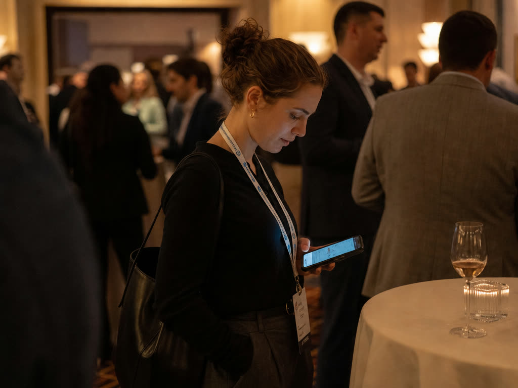
Here's the uncomfortable truth: most engagement features were designed to be measurable, not relational. They generate clean charts. Charts close sponsorship renewals. So we keep optimizing for charts, while the actual job-to-be-done, helping attendees meet each other, sits unowned.
If your last event had record engagement and a quiet sponsor lounge, you're not failing at events. You're succeeding at the wrong metric.
Five reasons it keeps happening. Each with a fix.
Reason 1: Content Is Easier to Optimize Than Connection
§ 02 · Reason 01Engagement-on-content is a clean loop. You publish a poll, the platform shows you a vote count, you put the count on the recap deck. Done. The metric closes itself.
Connection has no such loop. It happens in hallways, on the walk back to the hotel, in a follow-up email three weeks later. None of that shows up on your event-tech dashboard.
So you optimize the thing the dashboard can see. And the thing the dashboard can't see, the thing your attendees actually came for, slowly starves.
Treat connection as a first-class metric, not a vibe. Track meetings booked, intros completed, contacts saved, and post-event follow-ups sent. Put those numbers on the same slide as session attendance.
The moment connection is on the deck, the event design starts bending toward it.
Reason 2: Engagement Activities Are Often Solo
§ 02 · Reason 02Voting in a live poll is a solo act. So is reacting on the app, scanning a booth, watching a keynote, saving a session, posting a clip. The attendee is engaged with the event, not with other attendees.
The room can be lit up with activity, and still be silent. Heads down, thumbs moving, nobody talking.
An engagement strategy made of solo tasks produces a roomful of strangers who are each individually entertained.
Replace passive engagement with peer engagement wherever you can. A live poll becomes a "share your answer with the person next to you" prompt. A keynote question becomes a roundtable. A booth scan becomes a 5-minute paired discussion.
Same activity, half the time, ten times the connection.
Reason 3: Big Sessions Create Passive Crowds
§ 02 · Reason 03A 600-person keynote engages 600 people at once. That's a great number for the engagement slide. It's a terrible format for talking to anybody.
You can't turn around in a row of seats. You can't pick up where the speaker left off without shouting. Half the room is already getting up to make the next session on time.
Stack four of these in a row and you've burned an entire day of "engagement" with zero attendee-to-attendee conversation.
Reduce session sprawl. Fewer keynotes, fewer panels, more white space. Replace one big plenary per day with a 45-minute curated mixer or topic-table session.
Your average attendee should leave with at least two real conversations, not nine scribbled session takeaways.
Reason 4: Gamification Sometimes Replaces Networking
§ 02 · Reason 04Scavenger hunts, badge points, leaderboards, sponsor scans. All meant to drive engagement. All very effective at it. None of them, on their own, build a relationship.
An attendee can hit the top of the leaderboard by scanning thirty QR codes and never holding a real conversation. They'll leave with a great t-shirt and an empty contact list.
You've rewarded motion. You haven't rewarded meeting anyone.
Re-point the rewards. Award points for completed intros, not for booth scans. Give the prize to the attendee who had three structured conversations, not the one who racked up the most app taps.
Gamify the outcome you actually want.
Reason 5: There's No Connection-Specific Survey Question
§ 02 · Reason 05Open your last attendee survey. Count the questions about content quality, speakers, venue, app, food. Now count the questions about whether attendees met anyone they'll stay in touch with.
For most events, that second number is zero. The thing your sponsors care about most is the thing you didn't ask.
If it isn't measured, it isn't real to the team next year. So next year's plan optimizes for content again. And the gap widens.
Add one question to your post-event survey: "How many people did you meet that you'll follow up with?" Track the average across the cohort. Pair it with: "Did the event help you find them, or did you find them on your own?"
Once that number has a baseline, every design decision starts answering to it.
A Connection-First Approach
§ 03 · The StackThe events that are closing this gap aren't running fewer engagement features. They're running them alongside a deliberate connection layer. The playbook looks like this:
- Treat connection as a metric, not a vibe
Track meetings booked, intros completed, and contacts saved in the same dashboard as session attendance. If it isn't measured, it isn't designed for.
- Reduce session sprawl
Fewer sessions, more white space. Trade one keynote a day for a 45-minute structured mixer. Your attendees keep the content and gain the room.
- Replace passive engagement with peer engagement
Polls become discussion prompts. Booth scans become 5-minute paired conversations. Same activity, real conversation attached.
- Use the app for matchmaking, not just content
Push relevant people, not just relevant sessions. The home screen should surface "three attendees worth meeting today," not the agenda for the fifth time.
- Curate, don't crowdsource
"Browse the attendee list" is a wall of strangers. AI-driven matchmaking based on role, goal, and stated focus beats it on every dimension.
- Measure both engagement and connection
Report both numbers, side by side. The gap between them is the insight. That gap is also where your next year's design work lives.
None of this means killing engagement features. It means refusing to confuse them with connection.
"Engagement is what attendees do alone. Connection is what they do with each other. Most events are perfecting the first and starving the second."
Connection by Design, Vol. 04Where Hoogah Fits
§ 04 · HoogahHoogah is built around the connection layer specifically. Pre-event attendee profiles give every guest context on who they are and who they're hoping to meet. AI matchmaking turns that profile into 2-3 curated intros before the event even starts.
On-site, those intros surface as suggested meetings, table seats, and structured icebreakers, not as another wall of strangers to browse. Every contact saved is auto-tagged with where they met and what they talked about, so nothing slips between the app and real life.
After the event, a built-in follow-up loop nudges both sides at the right interval and surfaces what each promised to send. Your engagement features still run. The connection layer runs alongside them, with its own numbers.
The Bottom Line
§ 05 · ConclusionEngagement is easy to measure, easy to optimize, and easy to mistake for impact. Connection is harder on all three counts. So the events that win in 2026 are the ones that stop letting the easy number stand in for the real one.
Your dashboard is not lying to you. It's just answering a different question than the one your sponsors and attendees are asking.
Run the engagement features. Run them well. And then build the connection layer next to them, with its own metrics, its own design choices, and its own line on the post-event report. Optimize for the relationship, not just the reaction.
- Bizzabo, Event Engagement Benchmarks 2026
- Eventbrite, Why Attendees Come Back
- Harvard Business Review, The Difference Between Attention and Trust